You wrote a book. So many great words, put together in elegant ways! Words matter!
Well, yes, they do. But no one will read them without a compelling, unique cover (sorry).
I took this to heart very early on and developed a plan: Operation Badass Cover Art -- from brainstorming, to articulating to William Morrow’s (amazing) art team, to a final product that delights me every time I look at it.
Here’s how I did it.
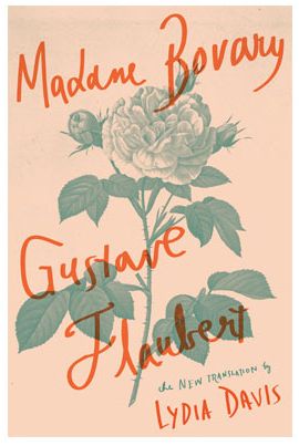
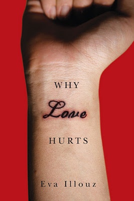
1. Create a Pinterest board.
Don’t worry about why you like them or if your examples are even book covers to begin with. Just trust your gut and pin things that speak to you. What would you pick up at the bookstore? What does your current bookshelf look like?
2. Look around your life.
my old apartment, painted in the colors of this Georgia O'Keeffe painting
What’s the color scheme of your life? I live in a jewel-toned apartment and wear colorful, textured clothes. Your personality -- and your palette -- are infused into your words. Make your cover match, too.
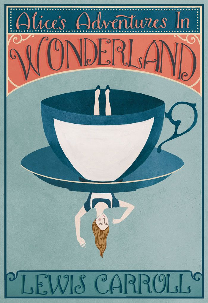
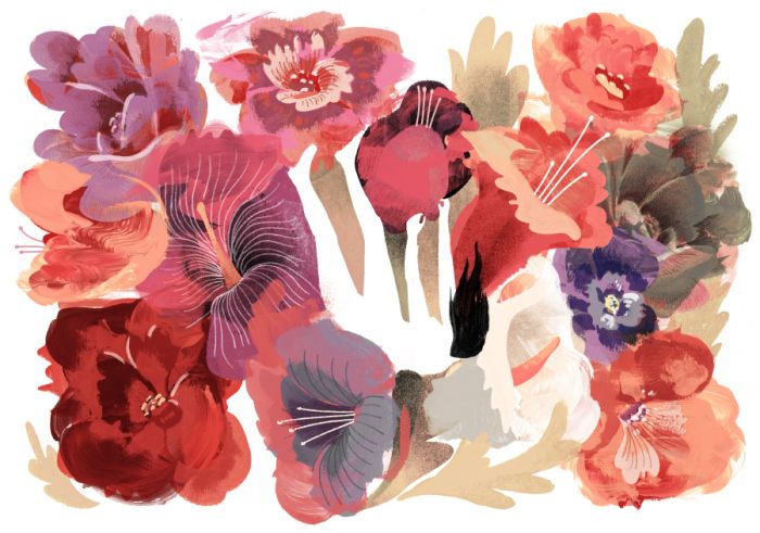
3. PICK OUT VISUAL THEMES.
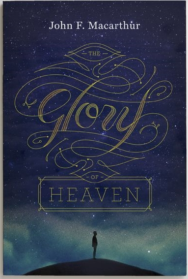
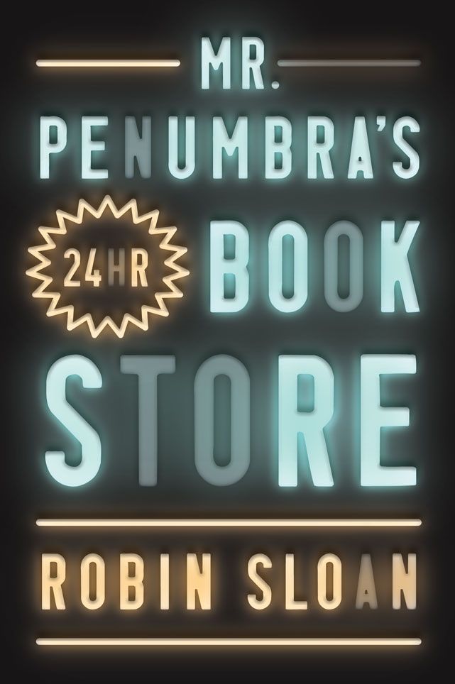
After enough thought, certain patterns will emerge. For me, I found that my personal style and the designs I liked fell into these two looks.
Lush & Pretty
Graphic
4. Pick out conceptual ideas.
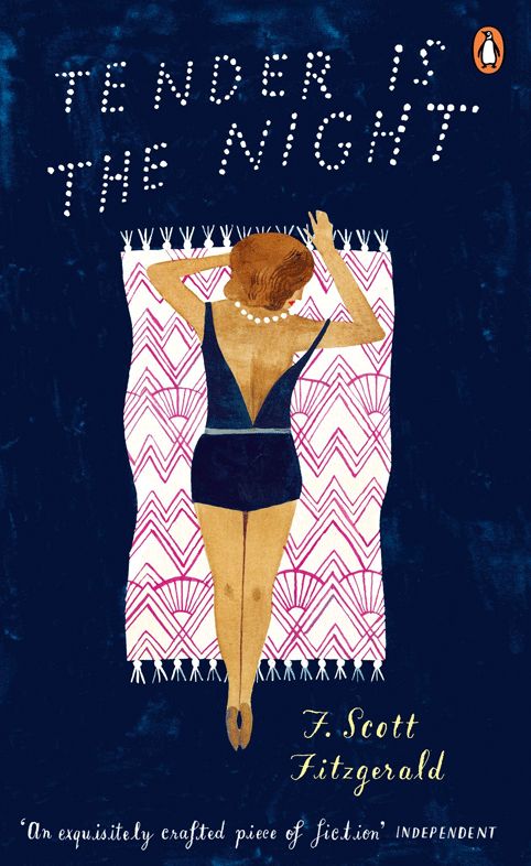
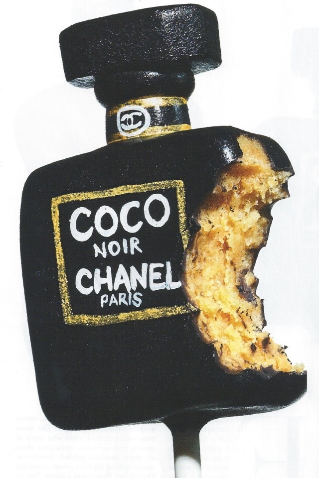
You’ll also find you like covers created with a certain technique. These were mine.
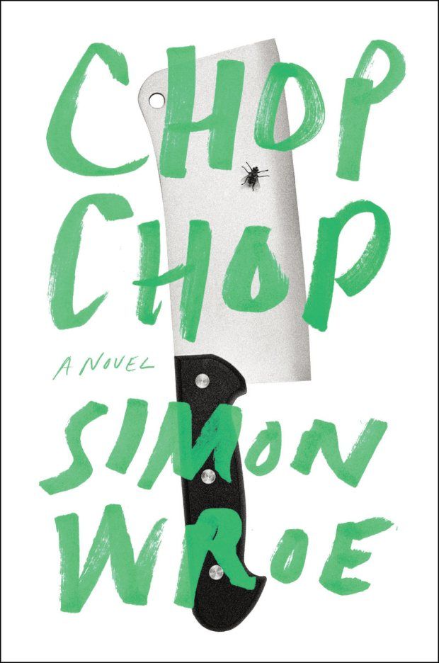
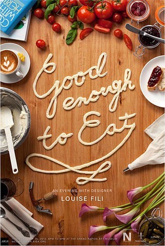
Food that tells a story
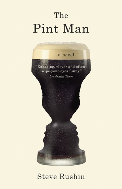
Make you look twice
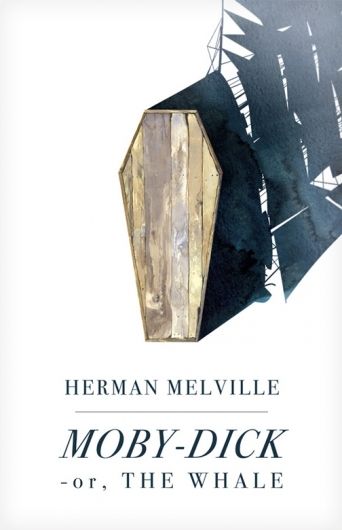
A hand-touch (something to make it look alive)
5. Pick out covers you don’t like.
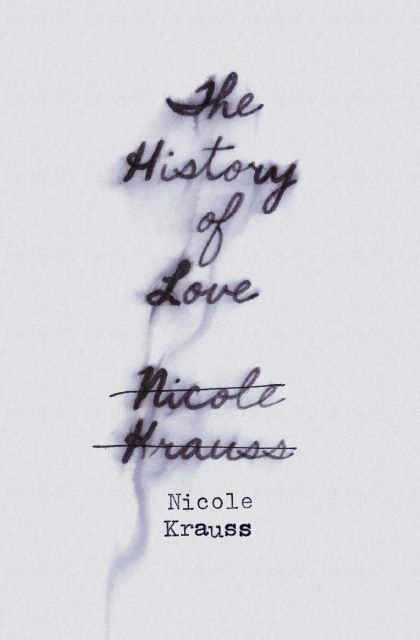
I won’t name them here because that’s rude. But you’ll know them when you see them. Perhaps the reasons are universal: they look cheap or cliché. Or, maybe your reasons are more specific to you -- you don’t like script, or images of people. It’s important your art team knows your dislikes as much as your likes.
6. Mock up your cover (optional).
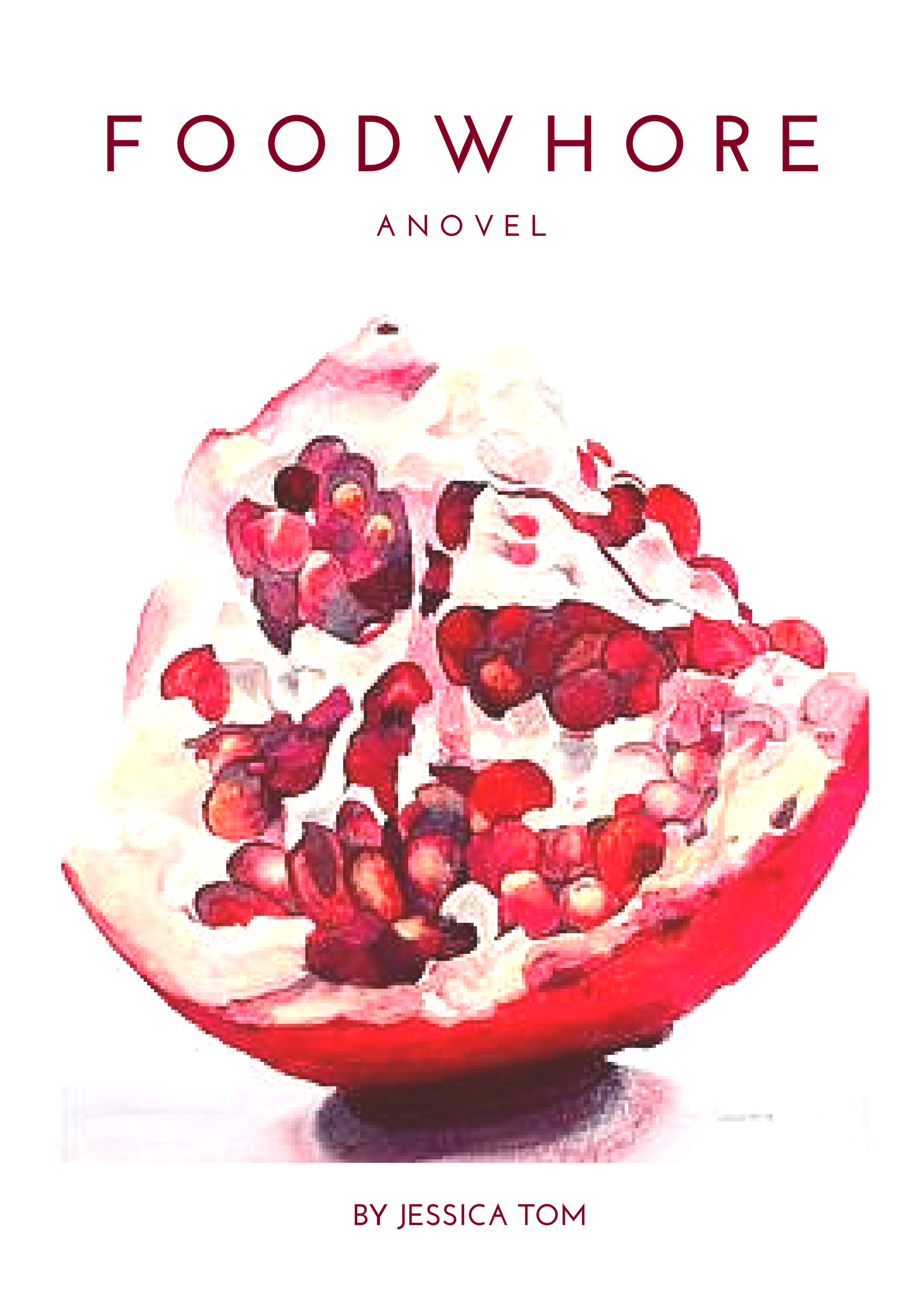
Sometimes you don’t want to beat around the bush and have to put pen to paper (or fingers to mouse). You can say you want X, Y, Z, but you won’t really know until you make it and see. I highly recommend Canva if you're not an actual graphic designer.
7. Send everything to your editor! (or to your designer if that’s your process )
I made a picture-heavy PDF presentation that included all of the above, along with “key elements” (themes and characters that could make good cover content). If you have explicit ideas for your cover, send them too.
So how did it turn out?
I think the William Morrow/ HarperCollins art team did an amazing job. What do you think?
The key is to 1) know what you want, 2) articulate it in a clear and actionable way for your art team, and 3) trust the process. Your cover art designer is like any designer -- he or she wants clear guidelines, and then: freedom to do his or her thing.


